Tuesday, 27 March 2012
Ideation
Some concept development sketches. Here I was trying to create the illusion of an elaborate backrest while still keeping it visually light. I also played with the possibility of combining the backrest and front legs into one fluid piece. While exploring different forms, I found drawing a simple profile of the side gave me much inspiration for three-dimensional forms.
Examining the backrest
I first thought the upholstery was glued onto the backrest. The fabric was stretched tautly without any creases and it was very neat. However after ripping the staples away, the fabric fell apart and revealed the plywood underneath. It was not glued on like what I expected. My first thoughts were, the craftsman did a very neat job but went crazy with the staple gun, because it took ages to remove just a section of it. The clean plywood also meant that reusing this part would be possible. This plywood backrest was connected to the seat with several nails at the bottom. Now if only that would be as easy to rip out as the staples.
I want the new chair to...
- Remain a dresser chair
- Retain some of its opulence, but without the kitsch
- Be quite delicate and with feminine qualities
- Easily incorporate with any dresser- super modern or very
traditional
- More 'beautiful' than utilitarian
- Have a good proportion/balance of big backrest to short legs
Tuesday, 20 March 2012
My Chair: Photo essay & written statement
Judging from its appearance, this chair seems like a 1970s dresser chair.
Its low seating, dainty size and feminine form are features that suggest it
serves that particular use. Its oversized backrest can serve the function of a makeshift
rack for clothes and other wardrobe peripherals to be temporarily hung on,
another reason why it could be a dresser chair.
The style of the chair is a blend of traditional and contemporary,
an attribute of the 1970s postmodern movement. The form of the chair is simple,
incorporating clean lines and organic curves, and its legs are tapered thin
towards the end without any fussiness. All of which follow the principles of
modern design. Yet, there is an injection of ornamentation and old world charm
with its choice of fabric. The upholstery of the chair is dramatic and made
elaborate in floral patterns, evoking a Victorian vibe. This however is again
toned down in a muted color palette of ivory. This balance of old and new,
utilitarian and decoration, gives the chair its 70s postmodern characteristics.
The construction of the chair seems to be done by conventional
manufacturing methods using conventional materials. The legs are mostly made
out of timber and the tips that would come into contact with the floor are
attached with circular metal fittings to give the chair more balance. It is
then screwed on to a metal fitting that is attached to the pinewood frame of
the seat.
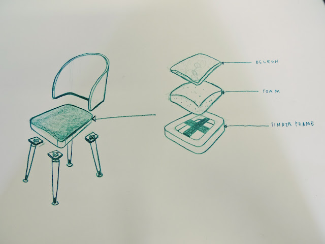
When disassembled, the seat consists of 4 main parts- the pinewood
frame, foam, decron and fabric for upholstery. The backrest is a piece of curve
plywood manufactured using the bent lamination technique, in which wood veneers
are stacked, glued and pressed with molds. When completely dried, the backrest
is then covered with decron on one side and upholstered with fabric.
Sunday, 11 March 2012
Tuesday, 6 March 2012
The Model No. 14 chair by Michael Thonet was made using the steam-bent wood method. Solid beech wood was softened under a high pressure of steam and then bent into streamline forms. Beech wood veneers were stacked and heated by steam. They were then pressed into curved cast iron moulds and left to dry at about 70 degrees cel for about 20 hours. Altogether, this chair is made up of 6 pieces of steam-bent wood, 10 screws, 2 nuts and a woven cane seat.
Sunday, 4 March 2012
List C: late 20th / Current
The element of transparency and playfulness is evident that both Shiro Kuramata and Tom Dixon’s chairs. Kuramata used materials like
acrylic resin and wire mesh, and Dixon, thin steel rods, to give the illusion
of floating and lightness. Their chair designs often had an unexpected twist-
Kuramata’s Miss Blanche chair had paper flowers cast in it, while Dixon’s fan
chair had a back rest that was unusual in scale- yet the core values of
function and ingenuity remains prevalent in both their work.
List B: Mid 20th C/ Late 20th C
Harry Bertoia and Verner Panton’s styles may seem different
at a glance. Panton favored a futuristic Pop Art approach and an unapologetic
use of vibrant colors. Bertoia, on the other hand, fancied metal latticework
and a visual lightness in his chairs. Yet the two are more similar than
different in many ways. Both designers’ chairs have a strong sculptural element
to them. Panton’s S chair is a sweeping biomorphic form, while Bertoia’s chairs
are essentially fluid, metal pieces of art. Both were also pioneers in
experimenting with unconventional materials and innovative manufacturing
techniques. For instance, the Panton Chair was the first cantilevered chair
made from a single piece of plastic.
List A- late 19th C/ early 20th C
Arne Jacobsen introduced his chairs almost a century after Michael Thonet launched his. Despite the vast amount of time between them, both their styles were governed by a sense of functionalism. Jacobsen expressed his through geometric shapes while Thonet emphasized on clean lines. Both of them dabbled with plywood in the construction of their chairs. What sets the two plywood chairs apart, other than their form, would have to be their manufacturing processes. The pressure moulded veneer No. 7 chair is the result of the lamination technique. In contrast, Thonet’s No. 14 chair was steam-bent.
Subscribe to:
Comments (Atom)


